fluentio
product design, UX/UI, mobile app, responsive website
Goal
Develop a platform that will allow users to learn new languages in a fun bite-sized format.
Product
The goal of this project was to design a language learning platform that is fun and intuitive to use. The target audience were people aged 12 - 65 who have an interest in learning new languages.
Problem
Many people are too busy to learn new languages, and using traditional methods such as classes and textbooks can be time consuming and boring.

Understanding the user
I conducted interviews and created empathy maps to understand the users I’m designing for and their needs. A primary user group identified through research was working adults don’t have a lot of time to learn a new language.
Time
Working adults have very little time to devote to learning a new language.
User Pain Points
Engagement
Traditional methods such as classes and textbooks can be time consuming and expensive.
wireframes
My early wireframes focused on the placement of elements and layout of the pages for easy and intuitive navigation.
low-fidelity prototype
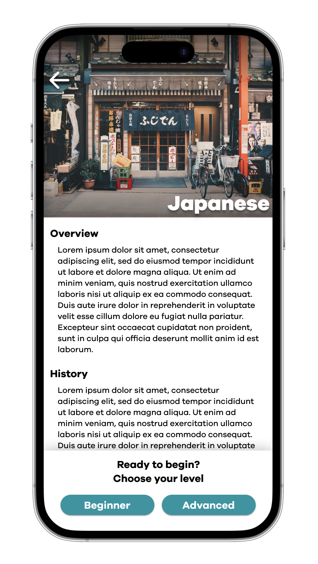
The low-fidelity prototype connected the primary user flow of selecting a language, reading information about the language, and finally completing the a lesson, so the prototype could be used in a usability study with users.
View the Fluentio low-fidelity prototype
usability study: findings
I conducted two rounds of unmoderated usability testing. Findings from the first round guided my design decisions and changes from wireframes to mockups. The second round was conducted using a high-fidelity prototype and informed further changes.
Cues
Users wanted to be able to tell what lesson they were on when completing lessons.
Saving
Users wanted the ability to save problems that they were having trouble with for later.
Information Page
Users wanted the ability to go back to the information page without going back to the language selection screen


high-fidelity prototype
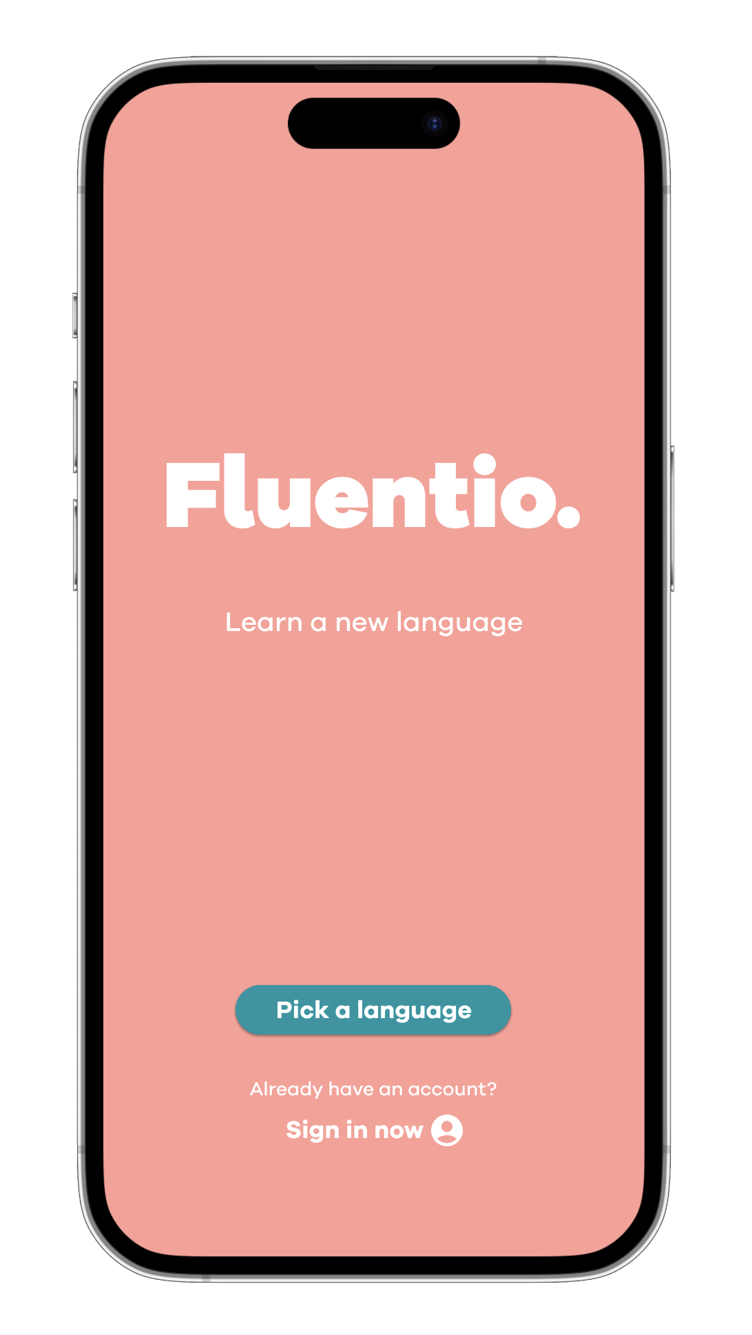
The high-fidelity prototype followed the same user flow as the low-fidelity prototype and included changes based on the usability study.
View the Fluentio high-fidelity prototype
Screen size variation
I considered various screen sizes during the design process. As many users not only use desktop but also mobile browsers I decided it was important to design for multiple screen sizes.
Takeaways
Impact
Users shared that the app seemed like a great way to learn a new language. They noted that the overall design of the app was inviting and pleasing to use.
What I learned
I learned that always going back to the user is key to coming up with the best solutions. It can be easy to get caught up in the design and visuals of a product but if users don’t find it useful then it is all for nothing.


